Pandas in the Pandaemic. (COVID-19 in Scotland - statistics) Part 3

This is the 3rd part of exploration of pandas package.
Part 2: https://www.vallka.com/blog/pandas-in-the-pandaemic-covid-19-in-scotland-statistics-part-2/
All data are taken from the official websate: weekly-deaths-by-location-age-sex.xlsx
Taken from official the site:
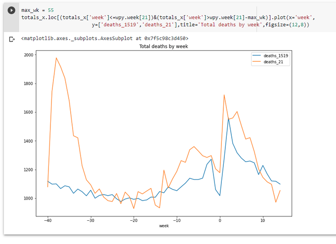
Let's have another look at the graph from the previous part: https://colab.research.google.com/drive/1a5FyWN5psehoqnAUEev0ODE2KNMiFTTE?usp=sharing
New data arrived. The line for the last week is going up a little, but still well below the average.
Ok, sit back, relax, and have a sip from a flask. Why Flask? This is first what comes to mind we start taking about web data visualization with Python. Also we have a long list of libraries, let's just take one of the most popular - Plotly.
Plotly for Python is actually only a part of a family of products by Plotly. What we will use here - an ability to create data in json format by Plotly for Python.These json data can be used by Plotly for JS to plot a graph on a web page. A bit complicated. Easier done that said.
First we need to install Flask, Plotly and Plotly Express - the last one makes it easier to deal with Plotly.
pip install flask
pip install plotly
pip install plotly_express
Then we'll create a Flask application file: mycovidash.py
import json
from flask import Flask,render_template,request
import numpy as np
import pandas as pd
import plotly
import plotly.express as px

app = Flask(__name__)

def get_data():
    data_2021 = pd.read_excel ('https://www.nrscotland.gov.uk/files//statistics/covid19/weekly-deaths-by-location-age-sex.xlsx',
    sheet_name='Data',
            skiprows=4,
            skipfooter=2,
            usecols='A:F',
            header=None,
            names=['week','location','sex','age','cause','deaths']
            )

    data_2021['year'] = data_2021.week.str.slice(0,2).astype(int)
    data_2021['week'] = data_2021.week.str.slice(3,5).astype(int)

    data_1519 = pd.read_excel ('https://www.nrscotland.gov.uk/files//statistics/covid19/weekly-deaths-by-location-age-group-sex-15-19.xlsx',
            sheet_name='Data',
            skiprows=4,
            skipfooter=2,
            usecols='A:F',
            header=None,
            names=['year','week','location','sex','age','deaths'],
            )

    data_1519['cause'] = 'Non-COVID-19'

    data = data_1519.copy()
    data = data.append(data_2021)
    return data


def get_plot():
    data = get_data()

    dt1 = data.groupby(['year','week']).agg({'deaths':np.sum})
    dt1.reset_index(inplace=True)

    fig = px.line(dt1,x='week', y='deaths',line_group='year',color='year')

    fig = json.dumps(fig, cls=plotly.utils.PlotlyJSONEncoder)
    return fig

@app.route('/')
def init():
    fig = get_plot()
    return render_template('mycovidash.html',fig=fig)
We basically repeat my exercises from Part 2. But instead of using pandas' plot function we use Plotly Express' line function to build a line graph and output this figure as json. What is inside this json data? The short answer - everything needed to display a graph on html page.
We also need an html template file: mycovidash.html
<!DOCTYPE html>
<html>
<head>
    <meta charset="utf-8">
    <meta name="viewport" content="width=device-width, initial-scale=1">
    <title></title>
    <link rel="stylesheet" href="https://cdn.jsdelivr.net/npm/bulma@0.9.2/css/bulma.min.css">
</head>
<body>
    <section class="section">
        <div class="container">
            <h1 class="title has-text-centered">
                Weekly Deaths in Scotland
            </h1>

            <div id="myPlot"></div>
        </div>
        </section>
</body>
<script src="https://cdn.plot.ly/plotly-latest.min.js"></script>
<script>
    Plotly.newPlot('myPlot', {{ fig | safe }} );
</script>
</html>
Div myPlot is a place where the plot will be rendered. Plotly.newPlot function renders the plot, getting the data from the variable fig, which we set in the Python function. Notice that we need to use "| safe" filter (see Jinja documentation), otherwise our data in json format will be html-encoded and thus broken.
...And run the app:
export FLASK_APP=mycovidash.py
export FLASK_ENV=development
flask run
Opening localhost:5000 show show the following page:
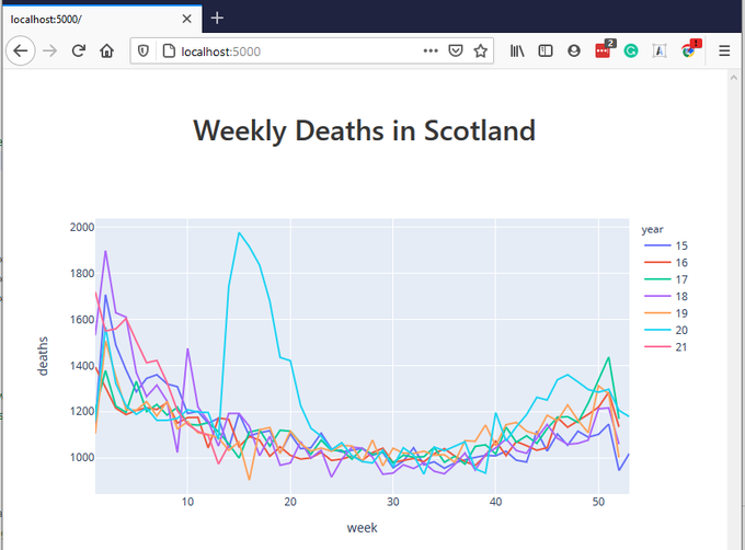
This graph is already interactive. You can hover over various parts of the graph, see additional controls which appear when you hover over certain places, play with these controls, e.g. zoom-in - zoom-out. It's already better that what we had before in Jupyter Notebook. (Yes, we could use the same Plotly functionality in a Jupyter Notebook, but now we wanted to build a web application using Flask)
Let's go further. Let's include checkboxes corresponding different groups in our data (year, age, sex, location, cause) and allow user include/exclude certain groups by checking/unchecking these checkboxes.
First, we need to find out what unique values these groups contain.
all_years = data['year'].unique()
all_ages = data['age'].unique()
all_sexes = data['sex'].unique()
all_causes = data['cause'].unique()
all_locations = data['location'].unique()
Looking at the data, all_ages contain slightly incorrect info: 0 value is represented twice - as string '0' and as an integer 0. We need to clean the data. As all other values for age are strings, let's just convert all integer 0s to string '0's, adding a simple line to get_data function:
data.loc[data['age']==0,'age']='0'
Next we need to pass all these lists to our template.
...
def get_plot():
    data = get_data()

    all_years = data['year'].unique()
    all_ages = data['age'].unique()
    all_sexes = data['sex'].unique()
    all_causes = data['cause'].unique()
    all_locations = data['location'].unique()

    dt1 = data.groupby(['year','week']).agg({'deaths':np.sum})
    dt1.reset_index(inplace=True)

    fig = px.line(dt1,x='week', y='deaths',line_group='year',color='year')

    fig = json.dumps(fig, cls=plotly.utils.PlotlyJSONEncoder)
    print (all_years,all_ages,all_sexes,all_causes,all_locations)
    return fig,all_years,all_ages,all_sexes,all_causes,all_locations

@app.route('/')
def init():
    fig,all_years,all_ages,all_sexes,all_causes,all_locations = get_plot()
    return render_template('mycovidash.html',fig=fig,all_years=all_years,all_ages=all_ages,all_sexes=all_sexes,all_causes=all_causes,all_locations=all_locations)
And in mycovidash.html, just after <div id="myPlot"></div>:
            <div class="columns">
                <div class="column is-2">
                    Years:<br>
                    {% for s in all_years %}
                    <input type="checkbox" value="{{ s }}" class="years_cb" checked> 20{{ s }}<br>
                    {% endfor %}
                </div>
                <div class="column is-2">
                    Age:<br>
                    {% for s in all_ages %}
                    <input type="checkbox" value="{{ s }}" class="ages_cb" checked> {{ s }}<br>
                    {% endfor %}
                </div>
                <div class="column is-1">
                    Sex:<br>
                    {% for s in all_sexes %}
                    <input type="checkbox" value="{{ s }}" class="sexes_cb" checked> {{ s }}<br>
                    {% endfor %}
                </div>
                <div class="column is-3">
                    Location:<br>
                    {% for s in all_locations %}
                    <input type="checkbox" value="{{ s }}" class="locations_cb" checked> {{ s }}<br>
                    {% endfor %}
                </div>
                <div class="column">
                    Cause:<br>
                    {% for s in all_causes %}
                    <input type="checkbox" value="{{ s }}" class="causes_cb" checked> {{ s }}<br>
                    {% endfor %}
                </div>
            </div>
            <div class="has-text-centered">
                <button id="update" class="button is-primary">Update</button>
            </div>
(It's time to notice that in this html file I used Bulma css framework instead of usual Bootstrap. I found Bulma very promising and easier to use than Bottstrap. Let's see...)
Now as all checkboxes are populated, we need somehow to react to them. Let's use it the most usual way - using jQuery and ajax call. These lines are going into out template:
<script src="https://code.jquery.com/jquery-3.6.0.min.js" integrity="sha256-/xUj+3OJU5yExlq6GSYGSHk7tPXikynS7ogEvDej/m4=" crossorigin="anonymous"></script>
    $('#update').click(function(){
        let years = '';
        $(".years_cb:checked").each(function(){
            years += this.value + ','
        })
        let ages = '';
        $(".ages_cb:checked").each(function(){
            ages += this.value + ','
        })
        let sexes = '';
        $(".sexes_cb:checked").each(function(){
            sexes += this.value + ','
        })
        let locations = '';
        $(".locations_cb:checked").each(function(){
            locations += this.value + ','
        })
        let causes = '';
        $(".causes_cb:checked").each(function(){
            causes += this.value + ','
        })

        $.ajax({
            url: "/update",
            type: "GET",
            contentType: 'application/json;charset=UTF-8',
            data: {
                years: years,
                ages: ages,
                sexes: sexes,
                locations: locations,
                causes: causes
            },
            dataType:"json",
            success: function (data) {
                Plotly.react('myPlot', data );
            }
        });
    })
In Python file we'll add additional route:
@app.route('/update')
def update():
    fig,all_years,all_ages,all_sexes,all_causes,all_locations = get_plot([request.args.get('years',''),
                        request.args.get('ages',''),
                        request.args.get('sexes',''),
                        request.args.get('locations',''),
                        request.args.get('causes',''),
                        ])
    return fig
... and add processing of these new arguments to get_plot function:
def get_plot(pars=None):
    ...
    years = list(map(int,pars[0].strip(',').split(','))) if pars else None
    ages = list(pars[1].strip(',').split(',')) if pars else None
    sexes = list(pars[2].strip(',').split(',')) if pars else None
    locations = list(pars[3].strip(',').split(',')) if pars else None
    causes = list(pars[4].strip(',').split(',')) if pars else None

    if years:
        data = data[data['year'].isin(years)]
    if ages:
        data = data[data['age'].isin(ages)]
    if sexes:
        data = data[data['sex'].isin(sexes)]
    if locations:
        data = data[data['location'].isin(locations)]
    if causes:
        data = data[data['cause'].isin(causes)]
        ...
One thing to notice. We have to use DataFrame.isin() method. Initially I wrote
data = data[data['year'] in (years)]
This failed, with an error message which is really difficult to interpret. But if we think about it, data['year'] is a Series object, which reminds a list. So actually using 'in' operator here would be something like [15,16,17,18,19,20,21] in [20,21] - what is apparently not what we want. But using .isin() method gives us exactly what we need.
Ok, it works now! You can select/deselect different groups and the plot is changing accordingly... but very slow. Of course, we need to add caching for the data. Let's use to_pickle method of DataFrame, whatever this format is:
import os
import time

...

def get_data():
    store_path = 'data.pkl'

    try:
        tm = os.path.getmtime(store_path)
        if int(time.time())-int(tm) > 24 * 60 * 60:
            raise Exception("Cache expired")

        data = pd.read_pickle(store_path)
        return data
    except Exception as e:
        print (e)
        pass

        ...

    data.to_pickle(store_path)
    return data
It's all for today.
Here is a GitHub repository: https://github.com/vallka/mycovidash
And here is a working version: http://api.vallka.com/mycovidash
Pandas in the Pandaemic. (COVID-19 in Scotland - statistics) Part 2
This is the 2nd part of exploration of pandas package. Part 1 can be found here: https://www.vallka.com/blog/leaning-pandas-data-manipulation-and-visualization-covid-19-in-scotland-statistics/
All data are taken from the official websate:
weekly-deaths-by-location-age-sex.xlsx
Taken from official the site:
Let's quickly repeat data load process from the Part 1:
import numpy as np
import pandas as pd

data_2021 = pd.read_excel ('https://www.nrscotland.gov.uk/files//statistics/covid19/weekly-deaths-by-location-age-sex.xlsx',
 sheet_name='Data',
        skiprows=4,
        skipfooter=2,
        usecols='A:F',
        header=None,
        names=['week','location','sex','age','cause','deaths']
        )

data_2021['year'] = data_2021.week.str.slice(0,2).astype(int)
data_2021['week'] = data_2021.week.str.slice(3,5).astype(int)

data_1519 = pd.read_excel ('https://www.nrscotland.gov.uk/files//statistics/covid19/weekly-deaths-by-location-age-group-sex-15-19.xlsx',
        sheet_name='Data',
        skiprows=4,
        skipfooter=2,
        usecols='A:F',
        header=None,
        names=['year','week','location','sex','age','deaths'])

data_1519['cause'] = 'Pre-COVID-19'

data=data_1519.copy()
data=data_1519.append(data_2021,ignore_index=True)
data
One note here. In part 1 I was using a simple assignment od DateFrame for making a copy. This is wrong. Simple assignment does not create a copy of a DataFrame, it just creates another reference to it, so all changes to 2nd DataFrame affects the original one. To make things even more interesting, pandas provides two versions of copy() function - copy(deep=False) and copy(deep=True) deep=True is default. Here is some discussion about all three.
It is not clear for me now what is the difference between simple assignment and shallow copy() (deep=False), nor my results confirm this discussion. But deep copy() (with default parameter deep=True) seems to be working as expected all the time.
Let's see the original data_1519 to ensure we didn't modify it accidently:
data_1519
Let's quickly create totals
totals = data.groupby(['year','week']).agg({'deaths': np.sum})
totals.loc[15,'deaths_15']=totals['deaths']
totals.loc[16,'deaths_16']=totals['deaths']
totals.loc[17,'deaths_17']=totals['deaths']
totals.loc[18,'deaths_18']=totals['deaths']
totals.loc[19,'deaths_19']=totals['deaths']
totals.loc[20,'deaths_20']=totals['deaths']
totals.loc[21,'deaths_21']=totals['deaths']
totals
Read more...
Leaning pandas. Data manipulation and visualization. (COVID-19 in - Scotland statistics)

Let's do a little bit of pandas. Pandas is (or are? :) extremely popular. Let's just dive in.
First of all, using pandas is the easiest way to open an Excel file. Just one line of code. Let's take, for example, this file -
Weekly deaths by location of death, age group, sex and cause, 2020 and 2021
(10 March 2021)
weekly-deaths-by-location-age-sex.xlsx
Taken from official the site:
https://www.nrscotland.gov.uk/.../related-statistics
import pandas as pd

data = pd.read_excel ('https://www.nrscotland.gov.uk/files//statistics/covid19/weekly-deaths-by-location-age-sex.xlsx',
 sheet_name='Data',
        skiprows=4,
        skipfooter=2,
        usecols='A:F',
        header=None,
        names=['week','location','sex','age','cause','deaths']
        )

data