Pandas in the Pandaemic. (COVID-19 in Scotland - statistics) Part 2
This is the 2nd part of exploration of pandas package. Part 1 can be found here: https://www.vallka.com/blog/leaning-pandas-data-manipulation-and-visualization-covid-19-in-scotland-statistics/
All data are taken from the official websate:
weekly-deaths-by-location-age-sex.xlsx
Taken from official the site:
Let's quickly repeat data load process from the Part 1:
import numpy as np
import pandas as pd
data_2021 = pd.read_excel ('https://www.nrscotland.gov.uk/files//statistics/covid19/weekly-deaths-by-location-age-sex.xlsx',
sheet_name='Data',
skiprows=4,
skipfooter=2,
usecols='A:F',
header=None,
names=['week','location','sex','age','cause','deaths']
)
data_2021['year'] = data_2021.week.str.slice(0,2).astype(int)
data_2021['week'] = data_2021.week.str.slice(3,5).astype(int)
data_1519 = pd.read_excel ('https://www.nrscotland.gov.uk/files//statistics/covid19/weekly-deaths-by-location-age-group-sex-15-19.xlsx',
sheet_name='Data',
skiprows=4,
skipfooter=2,
usecols='A:F',
header=None,
names=['year','week','location','sex','age','deaths'])
data_1519['cause'] = 'Pre-COVID-19'
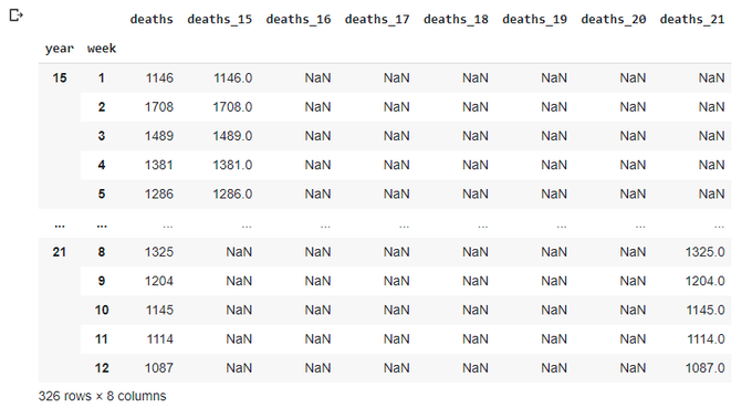
data=data_1519.copy()
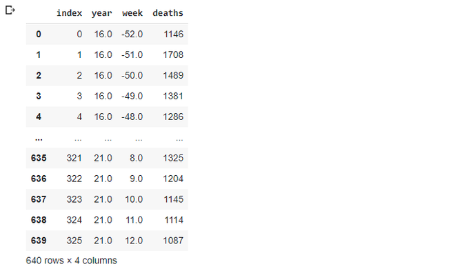
data=data_1519.append(data_2021,ignore_index=True)
data
One note here. In part 1 I was using a simple assignment od DateFrame for making a copy. This is wrong. Simple assignment does not create a copy of a DataFrame, it just creates another reference to it, so all changes to 2nd DataFrame affects the original one. To make things even more interesting, pandas provides two versions of copy() function - copy(deep=False) and copy(deep=True) deep=True is default. Here is some discussion about all three.
It is not clear for me now what is the difference between simple assignment and shallow copy() (deep=False), nor my results confirm this discussion. But deep copy() (with default parameter deep=True) seems to be working as expected all the time.
Let's see the original data_1519 to ensure we didn't modify it accidently:
data_1519
Let's quickly create totals
totals = data.groupby(['year','week']).agg({'deaths': np.sum})
totals.loc[15,'deaths_15']=totals['deaths']
totals.loc[16,'deaths_16']=totals['deaths']
totals.loc[17,'deaths_17']=totals['deaths']
totals.loc[18,'deaths_18']=totals['deaths']
totals.loc[19,'deaths_19']=totals['deaths']
totals.loc[20,'deaths_20']=totals['deaths']
totals.loc[21,'deaths_21']=totals['deaths']
totals
Let's get rid of multi-index and trnasform it into additional columns - I'm still thinking this is the quickest way of plotting data in a single plot:
totals.reset_index(inplace=True)
totals
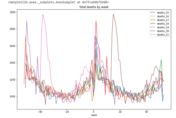
totals.plot(x='week',y=['deaths_15','deaths_16','deaths_17','deaths_18','deaths_19','deaths_20','deaths_21'],
    title='Total deaths by week',figsize=(12,8))
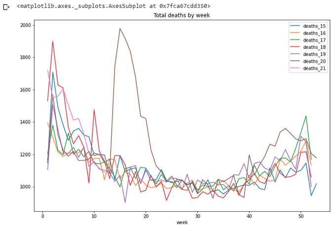
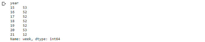
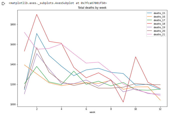
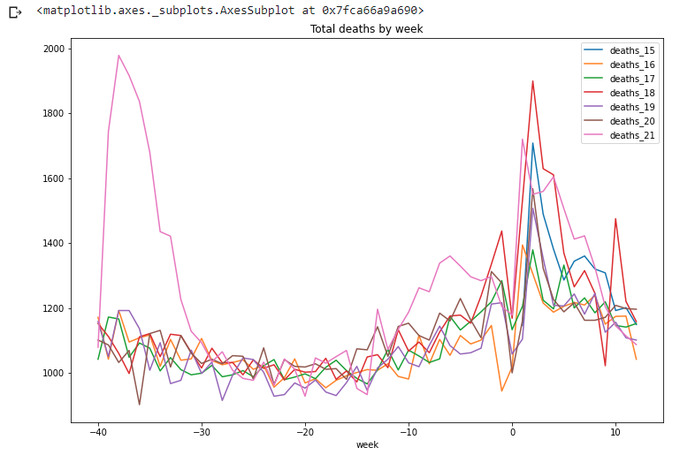
Again, let's look at current year only. Ok, a couple of weeks passed since I wrote Part 1. How many weeks in this year now? And more generic question, how many weeks in each year?
wpy = totals.groupby('year').agg({'week':np.max})
wpy['week']
totals[totals['week']<=wpy['week'][21]].plot(x='week',
    y=['deaths_15','deaths_16','deaths_17','deaths_18','deaths_19','deaths_20','deaths_21'],
    title='Total deaths by week',figsize=(12,8))
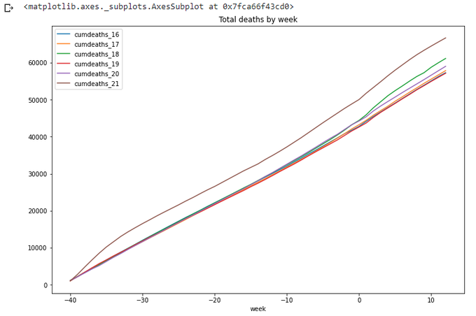
Let's move on and add cumulative values (or 'running totals'). Thanks to pandas, it is very easy - comparing to SQL. (There should be other ways to achieve the same result. I used the one which seemed the most simple for me on this stage of learning)
totals['cumdeaths_15']=totals.groupby('year').agg({'deaths_15':np.cumsum})
totals['cumdeaths_16']=totals.groupby('year').agg({'deaths_16':np.cumsum})
totals['cumdeaths_17']=totals.groupby('year').agg({'deaths_17':np.cumsum})
totals['cumdeaths_18']=totals.groupby('year').agg({'deaths_18':np.cumsum})
totals['cumdeaths_19']=totals.groupby('year').agg({'deaths_19':np.cumsum})
totals['cumdeaths_20']=totals.groupby('year').agg({'deaths_20':np.cumsum})
totals['cumdeaths_21']=totals.groupby('year').agg({'deaths_21':np.cumsum})

totals
totals.plot(x='week',
   y=['cumdeaths_15','cumdeaths_16','cumdeaths_17','cumdeaths_18','cumdeaths_19','cumdeaths_20','cumdeaths_21'],
     title='Total deaths by week',figsize=(12,8))
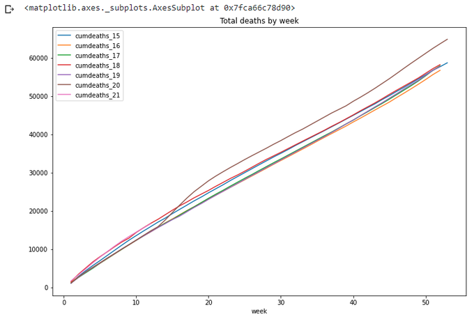
For a year-wide values year 2020 is definitely the worst. Also on this graph we can clearly see the difference of lengths of different years (in weeks), so it is not quite correct to compare year 2020 with 53 weeks with year 2019 with only 52 weeks. Which year is worse on this graph - 2015 or 2018?
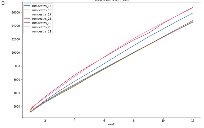
Again, let's take the beginning of year:
totals[totals['week']<=wpy['week'][21]].plot(x='week',
   y=['cumdeaths_15','cumdeaths_16','cumdeaths_17','cumdeaths_18','cumdeaths_19','cumdeaths_20','cumdeaths_21'],
   title='Total deaths by week',figsize=(12,8))
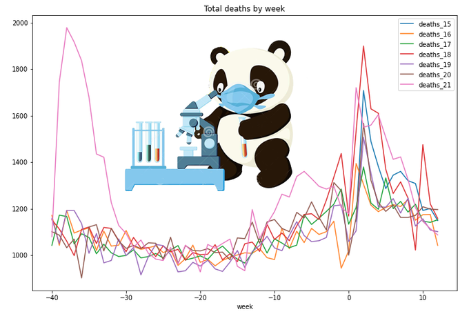
Ok, what's next? I think it would be interesting to look at year-length data back from the current date. That is, from March 2020 to March 2021 - and compare these data to the previous years. How to do this? Not obvious...
I came with a solution with building 'negative weeks' data. Let's call last week of 2020 - week 0 of 2021, week 52 of 2020 - week -1 of 2021, week 51 of 2020 - week -2 of 2021, and so on. We'll add these new 'negative' weeks to our dataframe, effectively doubling the data. We'll drop all the calculated columns now, we'll re-calculate them later:
totals1 = totals.reindex(columns=['year','week','deaths'])
totals1
totals0 = totals1.copy()
totals0.loc[(totals0.year==20),'week0'] = (totals0.loc[totals.year==20,'week']-wpy.week[20]).astype(int)
totals0.loc[(totals0.year==19),'week0'] = (totals0.loc[totals.year==19,'week']-wpy.week[19]).astype(int)
totals0.loc[(totals0.year==18),'week0'] = (totals0.loc[totals.year==18,'week']-wpy.week[18]).astype(int)
totals0.loc[(totals0.year==17),'week0'] = (totals0.loc[totals.year==17,'week']-wpy.week[17]).astype(int)
totals0.loc[(totals0.year==16),'week0'] = (totals0.loc[totals.year==16,'week']-wpy.week[16]).astype(int)
totals0.loc[(totals0.year==15),'week0'] = (totals0.loc[totals.year==15,'week']-wpy.week[15]).astype(int)
totals0.loc[(totals0.year==20),'year0'] = totals0.loc[totals.year==20,'year']+1
totals0.loc[(totals0.year==19),'year0'] = totals0.loc[totals.year==19,'year']+1
totals0.loc[(totals0.year==18),'year0'] = totals0.loc[totals.year==18,'year']+1
totals0.loc[(totals0.year==17),'year0'] = totals0.loc[totals.year==17,'year']+1
totals0.loc[(totals0.year==16),'year0'] = totals0.loc[totals.year==16,'year']+1
totals0.loc[(totals0.year==15),'year0'] = totals0.loc[totals.year==15,'year']+1

totals0 = totals0.loc[totals0['year0']>0]
totals0
A few more manipulations with columns...
neworder =['year0','week0','deaths']
totals0 = totals0.reindex(columns=neworder)
totals0.rename(columns={'year0':'year','week0':'week'},inplace=True)
totals0
Now we have totals1 with 'normal' weeks and totals0 with 'negative' weeks. Let's just combine them:
totals_x = totals0.copy()
totals_x = totals_x.append(totals1)
totals_x.reset_index(inplace=True)
totals_x
Now we'll repeat our exercise with adding columns for each year (there should be a better way of doing this, but let's not changing it for now)
totals_x.loc[totals_x['year']==15,'deaths_15']=totals_x['deaths']
totals_x.loc[totals_x['year']==16,'deaths_16']=totals_x['deaths']
totals_x.loc[totals_x['year']==17,'deaths_17']=totals_x['deaths']
totals_x.loc[totals_x['year']==18,'deaths_18']=totals_x['deaths']
totals_x.loc[totals_x['year']==19,'deaths_19']=totals_x['deaths']
totals_x.loc[totals_x['year']==20,'deaths_20']=totals_x['deaths']
totals_x.loc[totals_x['year']==21,'deaths_21']=totals_x['deaths']

totals_x.sort_values(['year','week'],inplace=True)

totals_x
We also need to re-sort the data, otherwise our line graphs will have gaps in unexpected places.
Now we can draw the graph for 2 years:
totals_x.plot(x='week',
    y=['deaths_15','deaths_16','deaths_17','deaths_18','deaths_19','deaths_20','deaths_21'],
        title='Total deaths by week',figsize=(12,8))
The lines repeat themselves. Yes, this is what we wanted.
Now we can simply take the last 53 weeks from this 2-year wide data:
max_wk = 53
totals_x.loc[(totals_x['week']<=wpy.week[21])&(totals_x['week']>wpy.week[21]-max_wk)].plot(x='week',
    y=['deaths_15','deaths_16','deaths_17','deaths_18','deaths_19','deaths_20','deaths_21'],
        title='Total deaths by week',figsize=(12,8))
Let's calculate running totals for this period. Not so straightforward, but still doable:
max_wk=53
totals_x1 = totals_x.loc[(totals_x['week']<=wpy.week[21])&(totals_x['week']>wpy.week[21]-max_wk)].copy()

totals_x1['cumdeaths_15']=totals_x1.groupby('year').agg({'deaths_15':np.cumsum})
totals_x1['cumdeaths_16']=totals_x1.groupby('year').agg({'deaths_16':np.cumsum})
totals_x1['cumdeaths_17']=totals_x1.groupby('year').agg({'deaths_17':np.cumsum})
totals_x1['cumdeaths_18']=totals_x1.groupby('year').agg({'deaths_18':np.cumsum})
totals_x1['cumdeaths_19']=totals_x1.groupby('year').agg({'deaths_19':np.cumsum})
totals_x1['cumdeaths_20']=totals_x1.groupby('year').agg({'deaths_20':np.cumsum})
totals_x1['cumdeaths_21']=totals_x1.groupby('year').agg({'deaths_21':np.cumsum})

totals_x1.plot(x='week',
        y=['cumdeaths_16','cumdeaths_17','cumdeaths_18','cumdeaths_19','cumdeaths_20','cumdeaths_21'],
                title='Total deaths by week',figsize=(12,8))
Well done pandas.
Ok, it's more or less obvious now that plotting all 7 years on the same graph is really messy. So let's just 'compress' years 2015-2019 into simple average line:
avg = totals[totals['year']<20].groupby('week').agg({'deaths':np.average,'year':np.max})

avg['year'] = 1519
avg.rename(columns={'deaths':'deaths_1519'},inplace=True)
avg.reset_index(inplace=True)
avg
We called this 'year 1519'. Let's add this new average year to the same data we have:
totals=totals.append(avg)
totals
Let's quickly plot the new line together with the original years, just to make sure we got it right:
totals[(totals['week']<=wpy['week'][21])&(totals['week']>0)].plot(x='week',
    y=['deaths_15','deaths_16','deaths_17','deaths_18','deaths_19','deaths_1519',],
        title='Total deaths by week',figsize=(12,8))
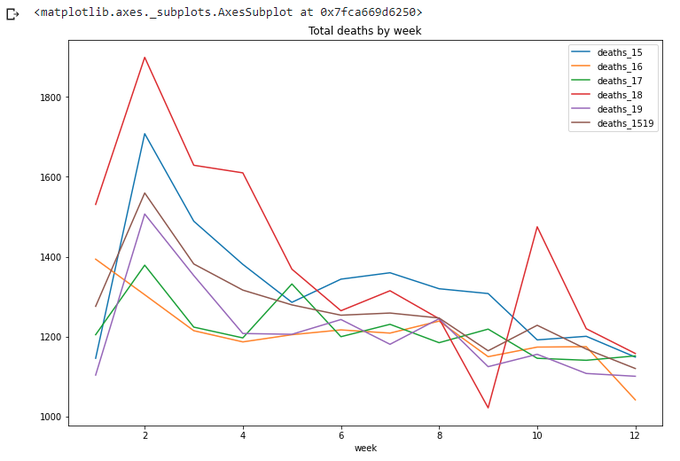
Looks right - the new line goes somewhere between other years.
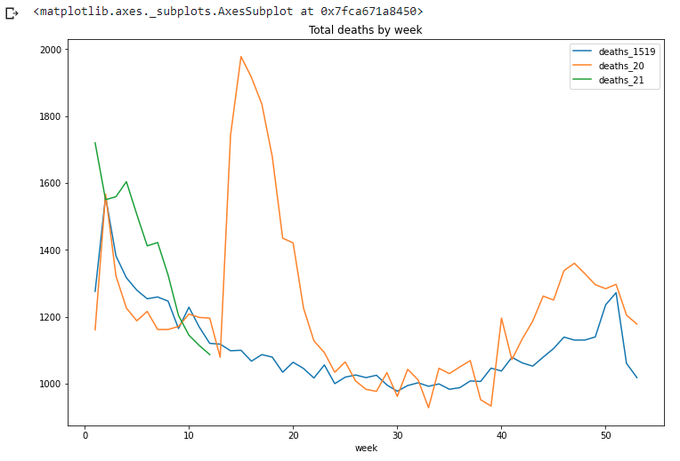
Let's plot the years of interest together with the average:
totals.plot(x='week',
    y=['deaths_1519','deaths_20','deaths_21'],
        title='Total deaths by week',figsize=(12,8))
What's about 53 weeks backwards from the current date? Let's repeat the calculation we already did, and get the result:
totals_x=totals_x.append(avg)
totals_x[totals_x['year']==1519]
avg0=avg.copy()
avg0['week']=avg0['week']-53
avg0
totals_x=totals_x.append(avg0)
totals_x.sort_values(['year','week'],inplace=True)
max_wk = 53
totals_x.loc[(totals_x['week']<=wpy.week[21])&(totals_x['week']>wpy.week[21]-max_wk)].plot(x='week',
                        y=['deaths_1519','deaths_21'],title='Total deaths by week',figsize=(12,8))
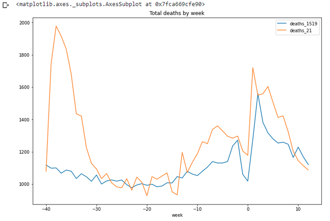
We can see that we are clear below the average for at least a couple of weeks now. Ok, let's stop for now. Well done pandas.
Next time we'll try to add some interactivity to the charts.
The code for today's article can be found on gist.github and Google Colab:
https://gist.github.com/vallka/621ea43c236f8f24f2c589190d5ca07f
https://colab.research.google.com/drive/1a5FyWN5psehoqnAUEev0ODE2KNMiFTTE?usp=sharing